
ARQ © 2025
ARQ is a (currently) fictional esports organization i came up with for learning purposes. With this project i put myself through the whole process of creating a full brand from the ground up.
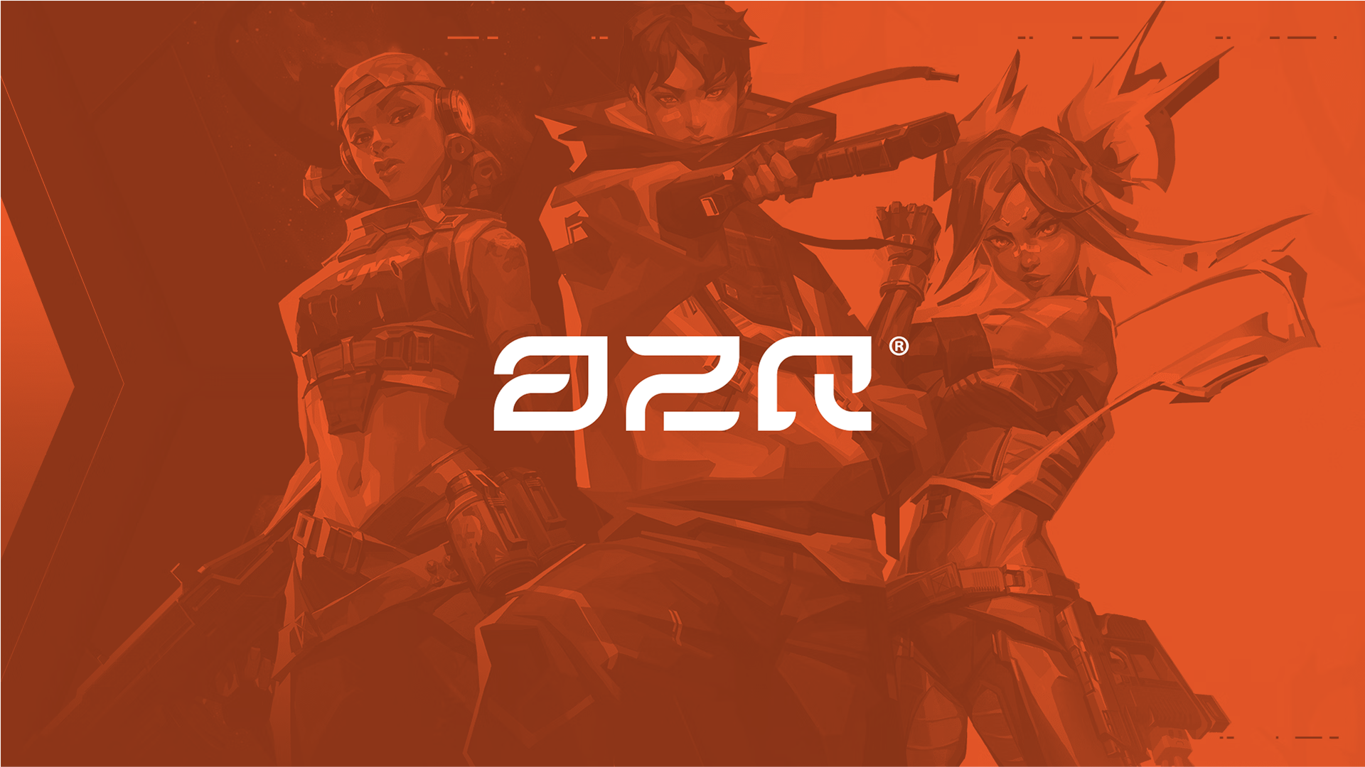
ARQ is a professional esports organization built on precision, discipline, and structure.
We compete with intent — turning pressure into performance and strategy into strength.
More than a team, ARQ is a system engineered to endure — a foundation for those who play with purpose.
We compete with intent — turning pressure into performance and strategy into strength.
More than a team, ARQ is a system engineered to endure — a foundation for those who play with purpose.
Brand Identity — Marvin Kreckwitz
Creative Direction — Marvin Kreckwitz
Logo — Marvin Kreckwitz
Visual Identity — Marvin Kreckwitz
Graphic Design — Marvin Kreckwitz
Year — 2025
Why?
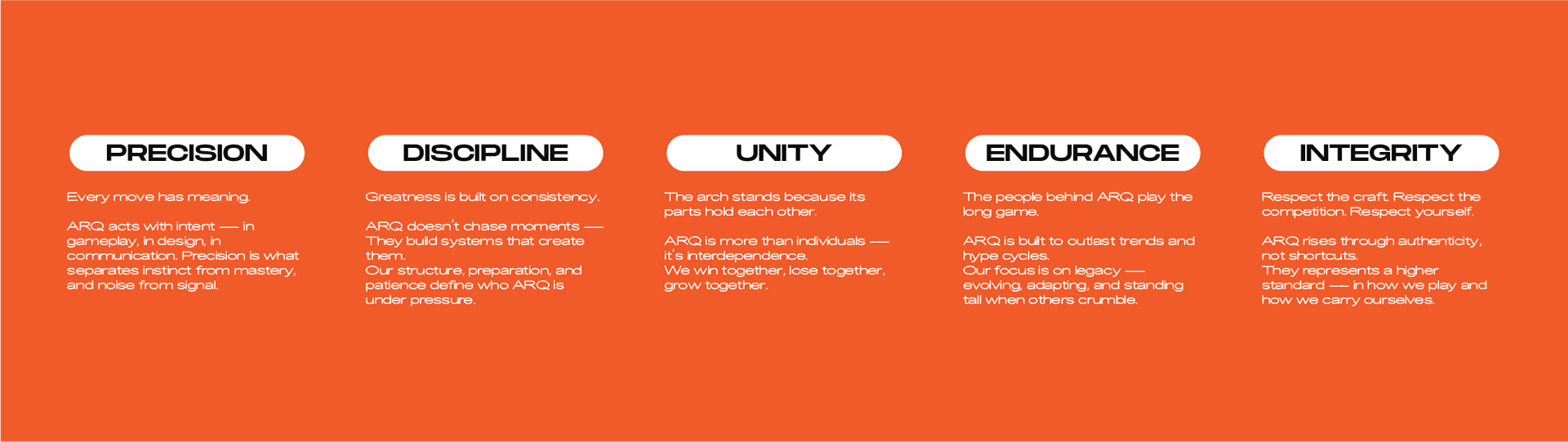
To build something that lasts. ARQ exists to redefine what it means to be a team — not just a lineup of players, but a structure of discipline, synergy, and precision.
In a space defined by chaos and short-lived hype, ARQ stands for endurance, control, and legacy.
They believe greatness isn’t built overnight — it’s engineered through consistency, trust, and pressure.
How?
ARQ plays with purpose.
Their strength lies in their architecture — every player, every decision, every move has intent. Their approach is methodical, coordinated, and calculated. Whether in-game or off, they operate with structure: strategy before ego, clarity before chaos, results before recognition.
This philosophy extends into how we present ourselves — through clean design, grounded visuals, and confident silence that speaks louder than noise.
What?
ARQ is a professional esports team and brand rooted in precision, unity, and endurance.
They compete in high-stakes FPS titles, create content that reflects our tactical mindset, and build a global community around the ARQ mentality — control under pressure.
ARQ isn’t just a name — it’s a system built to hold, evolve, and endure.
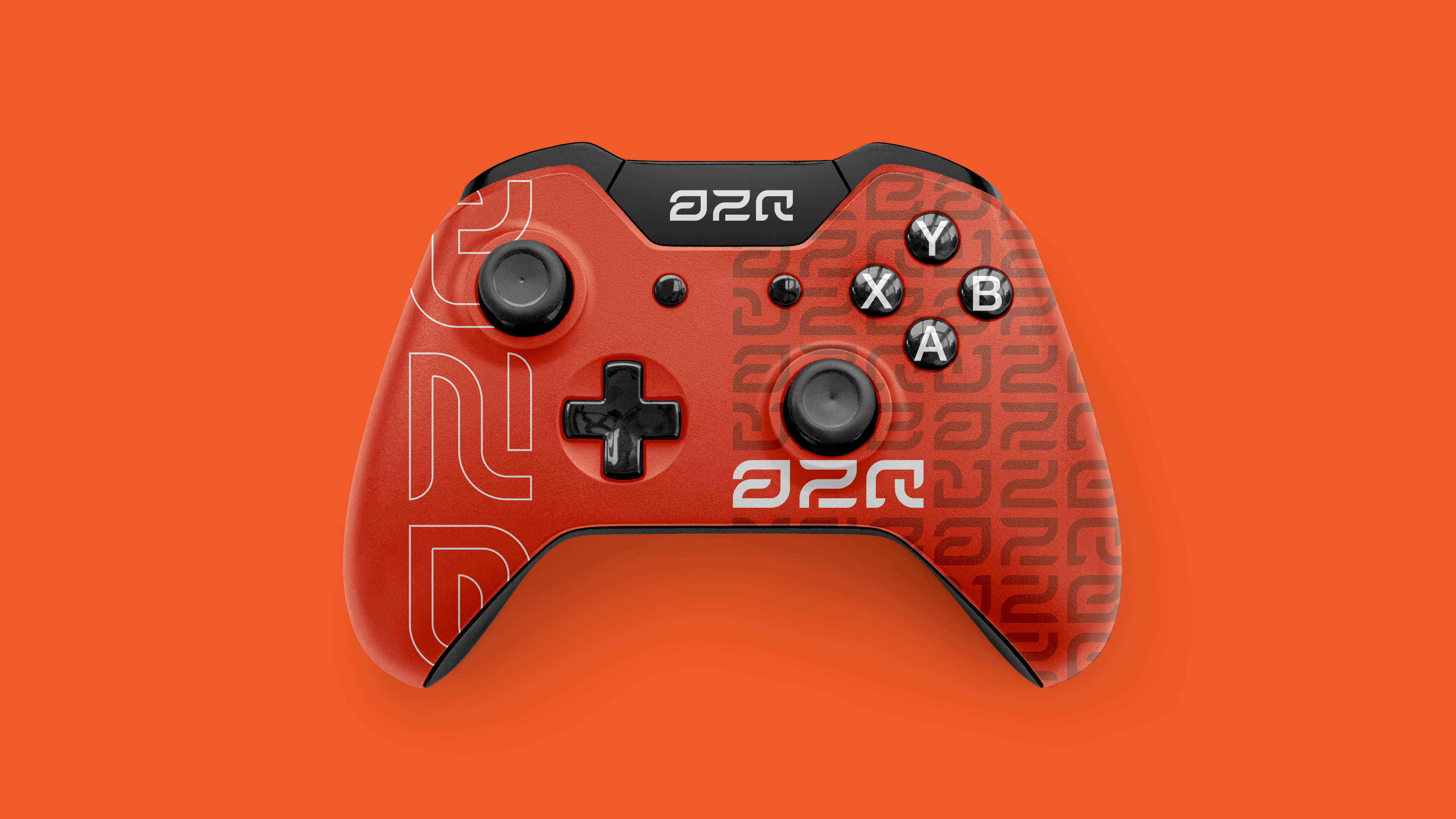
Colors
#f15a29 – Core Orange
A bold, high-energy orange that symbolizes drive, focus, and forward motion.
It brings heat to the palette — representing determination and the spark of competitive momentum.
It brings heat to the palette — representing determination and the spark of competitive momentum.
#ffaf94 – Soft Coral
A lighter, more human counterpart to the core orange.
It adds warmth and approachability, softening the intensity while keeping the palette vibrant and alive.
It adds warmth and approachability, softening the intensity while keeping the palette vibrant and alive.
#161cad – Deep Blue
Confident, composed, and strategic.
This tone anchors the brand — evoking trust, precision, and the calm discipline beneath the pressure.
This tone anchors the brand — evoking trust, precision, and the calm discipline beneath the pressure.
#f1e7e0 – Off-White Sand
A refined neutral that balances the palette.
It offers clarity and contrast, giving space for the bold tones to breathe while maintaining an understated sophistication.
It offers clarity and contrast, giving space for the bold tones to breathe while maintaining an understated sophistication.
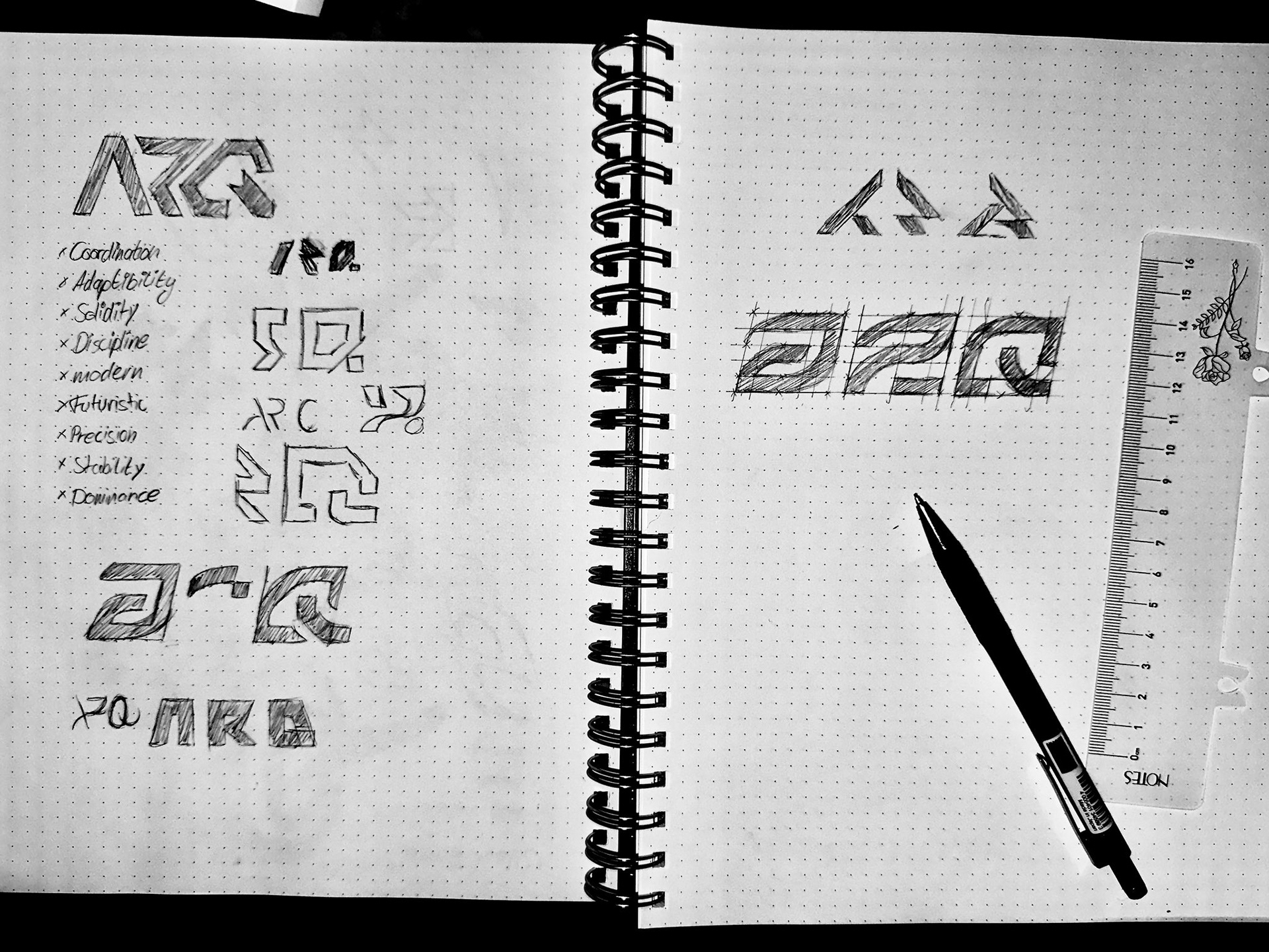
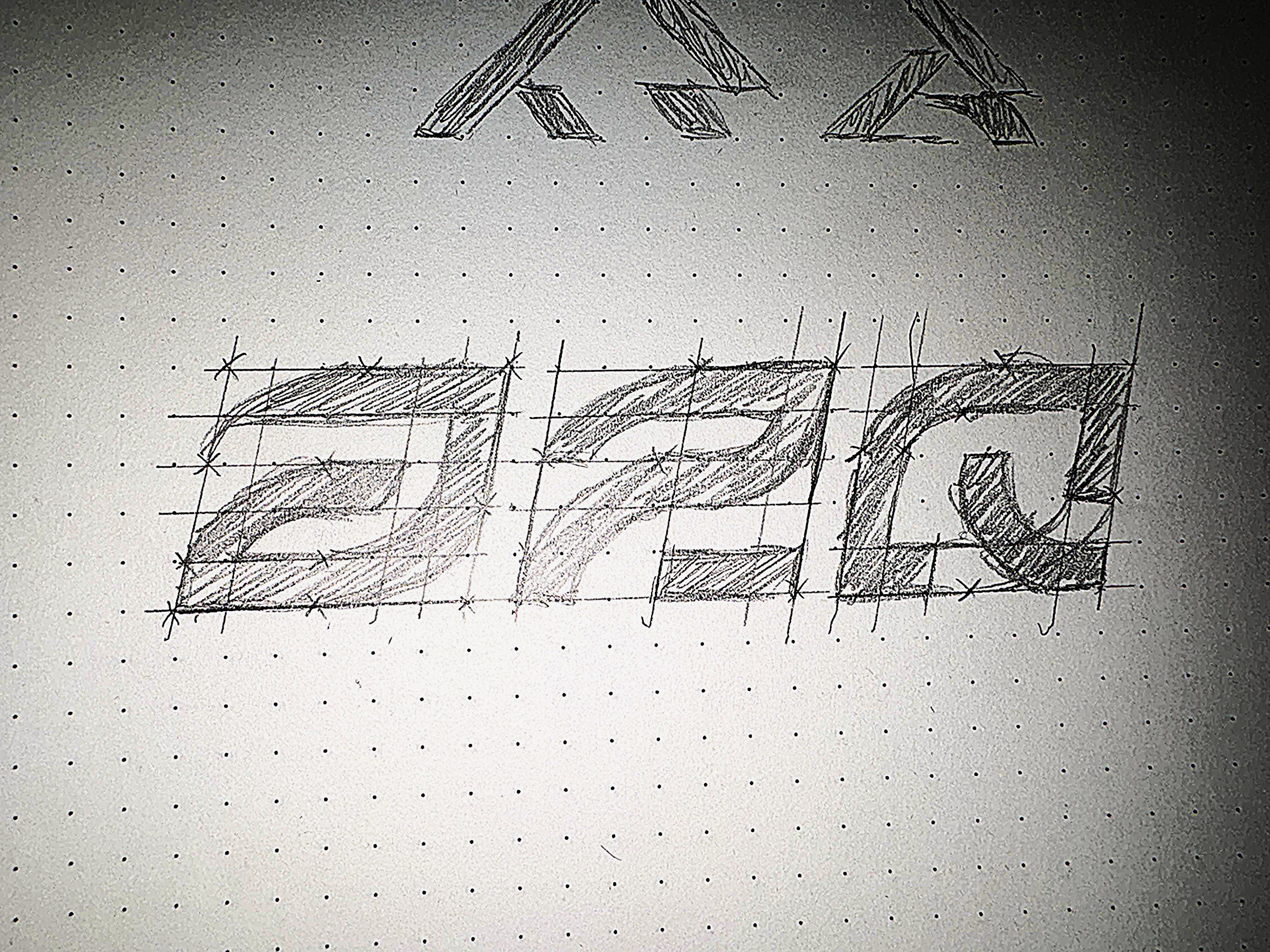

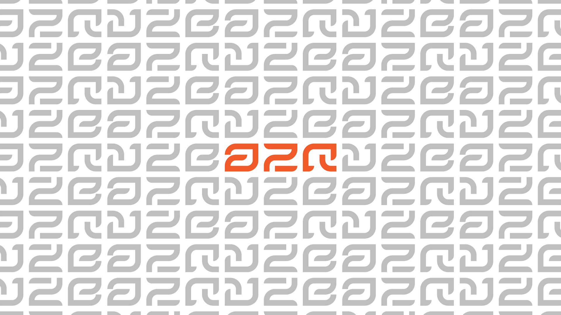
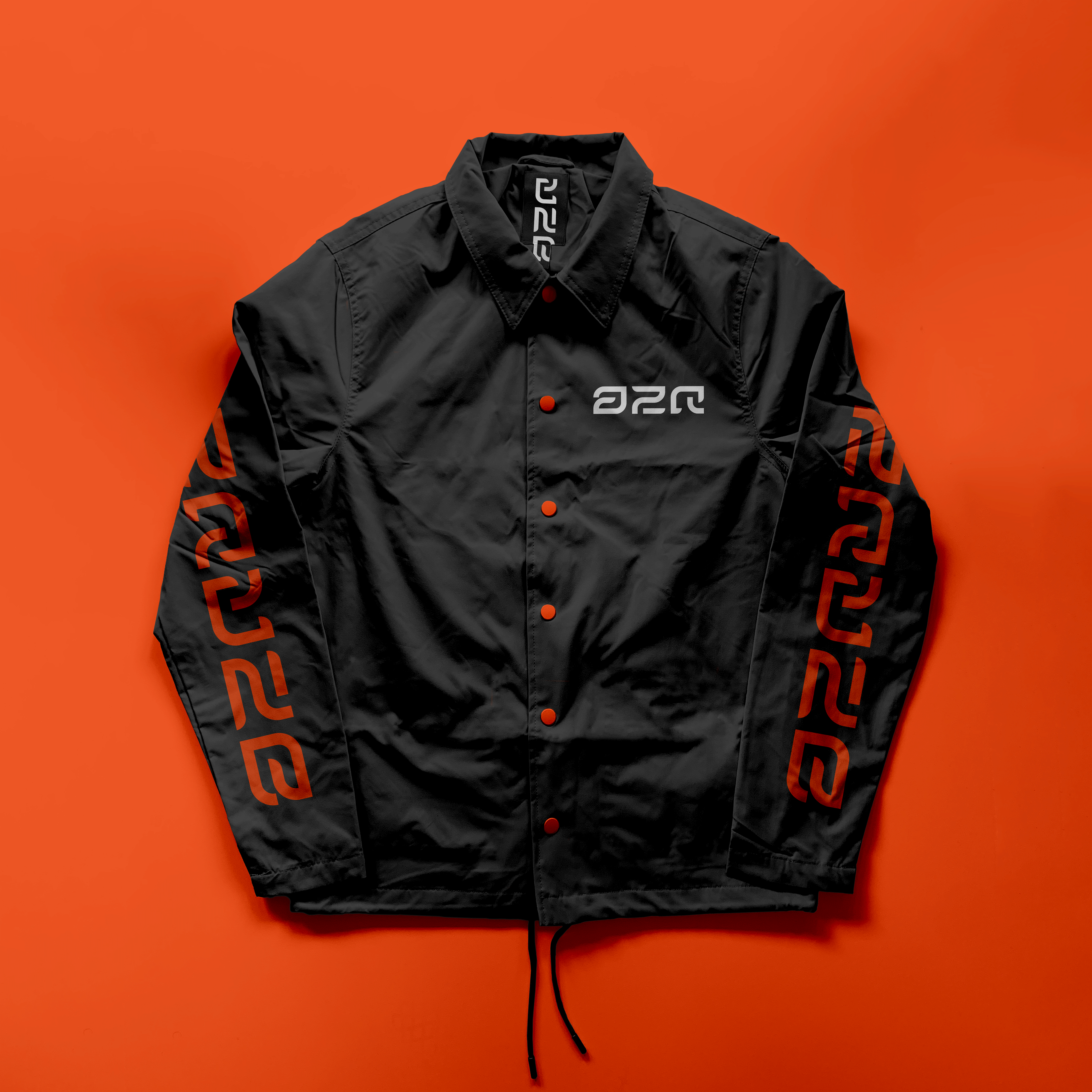
Logo Ideation & Creation
The ARQ logo embodies motion, precision, and control — the core of what the brand stands for.
Its geometric curves and sharp edges merge digital futurism with raw mechanical energy, symbolizing the connection between human creativity and technological innovation.
The continuous flow of each letter mirrors the seamless process from concept to creation, while the bold orange tone captures the brand’s drive, visibility, and confidence. Every angle and curve is intentional, designed on a strict grid system that reflects structure, discipline, and evolution — the foundation of ARQ’s design philosophy.

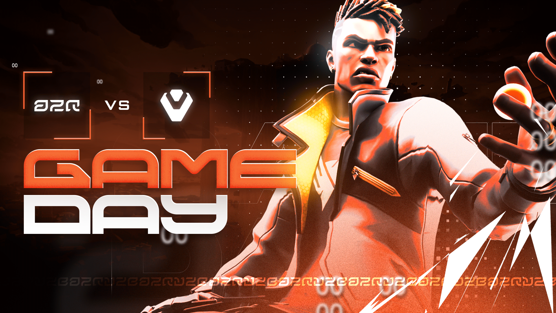
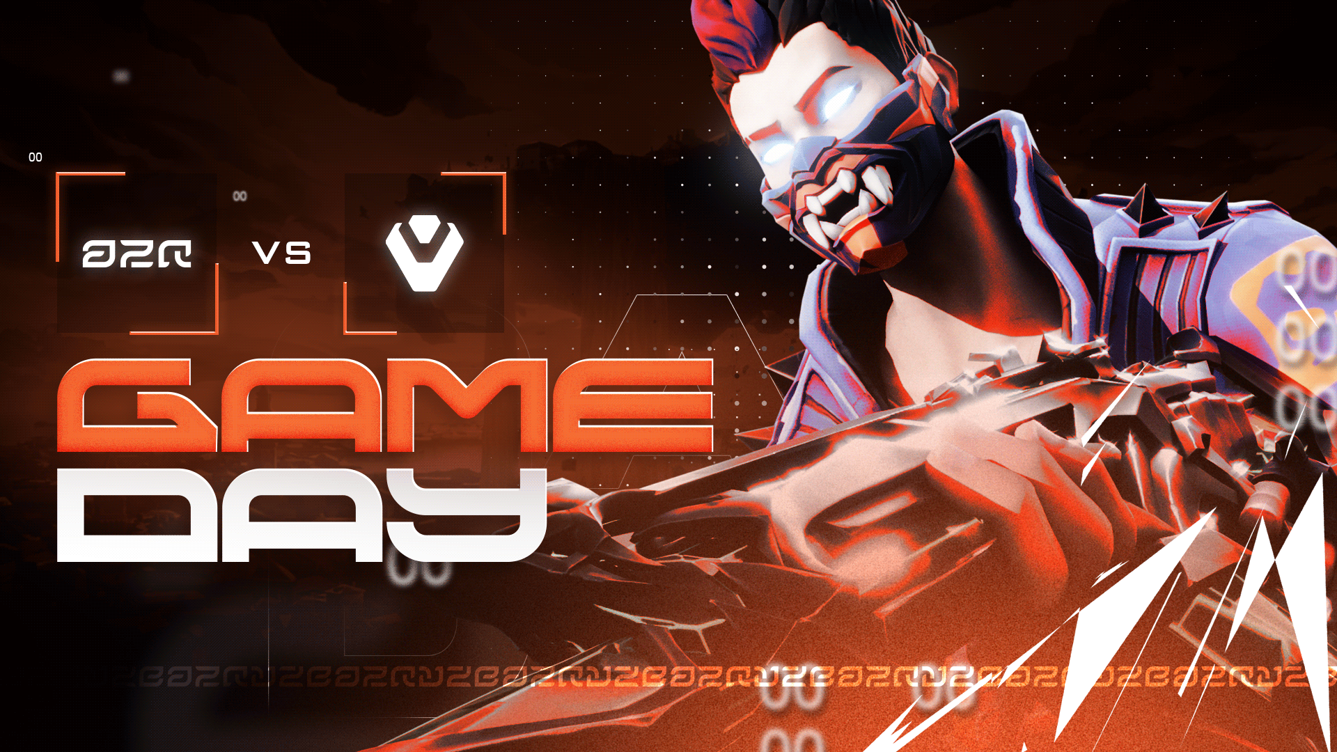
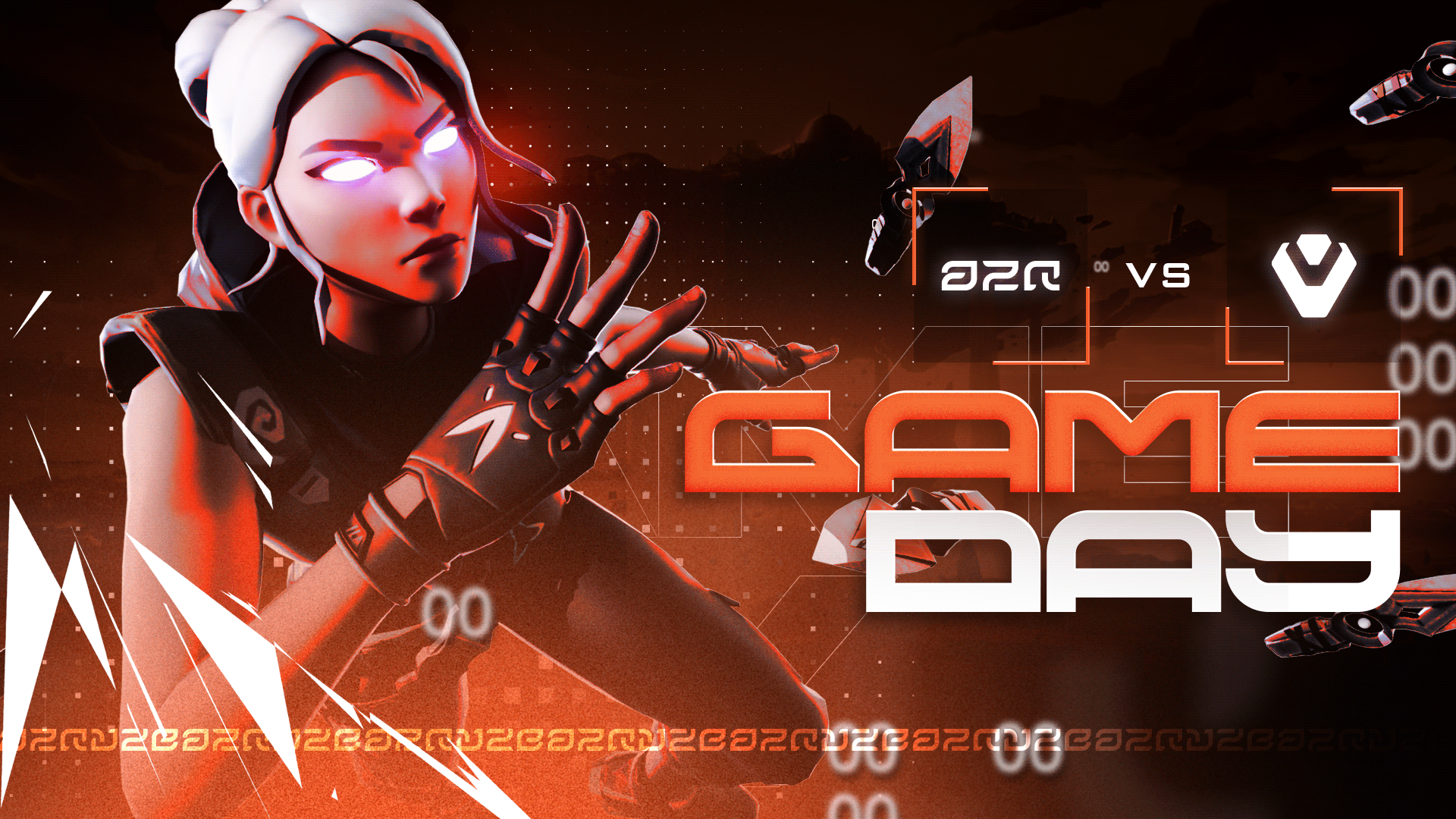
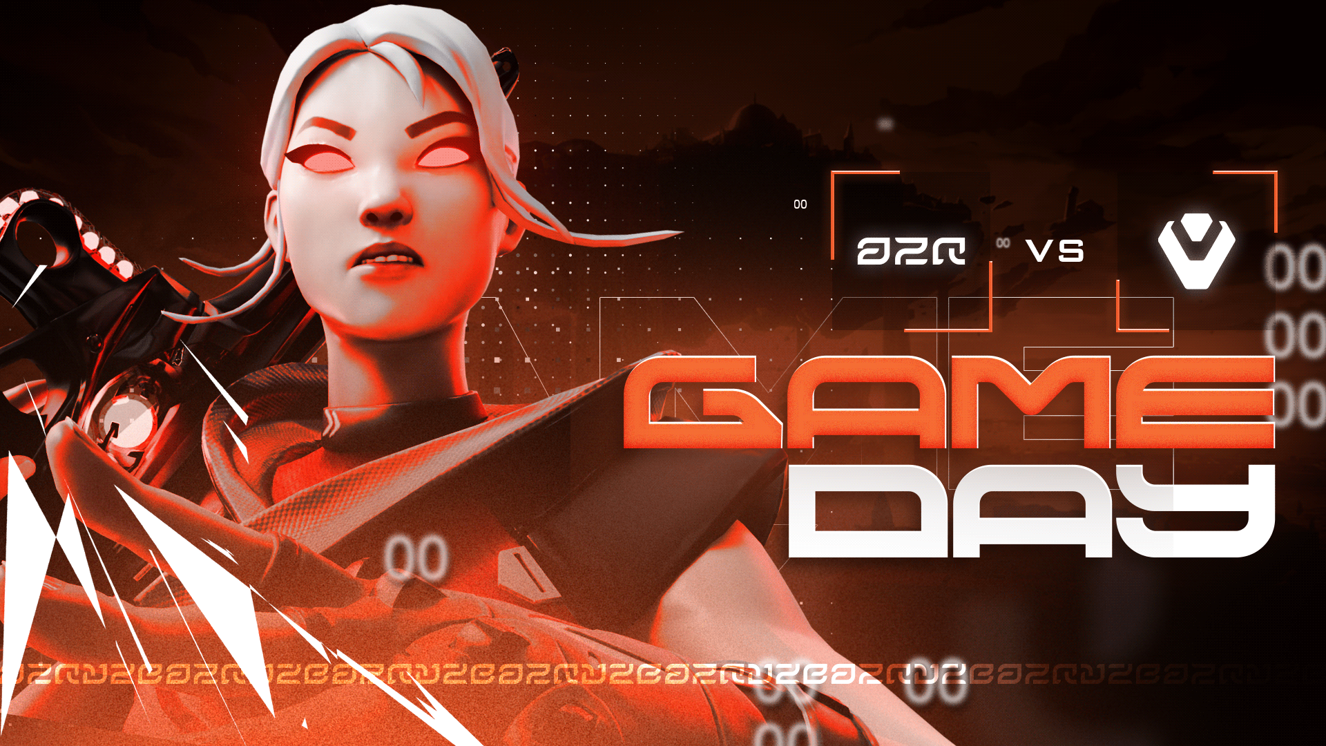
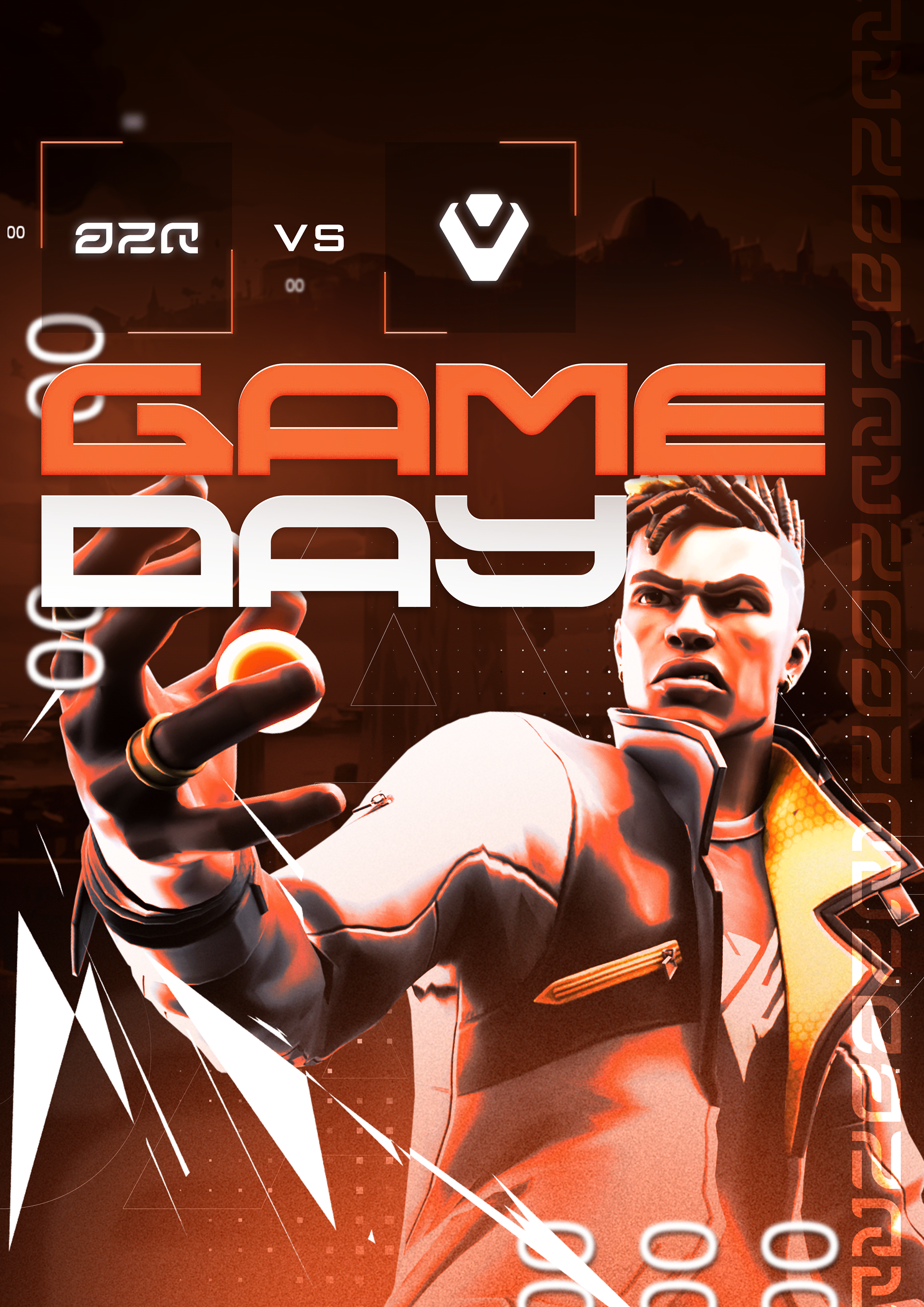
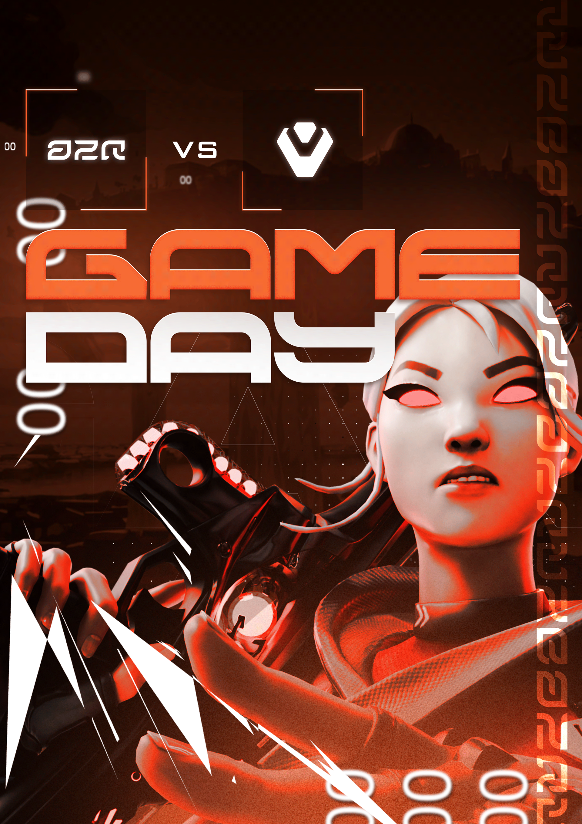
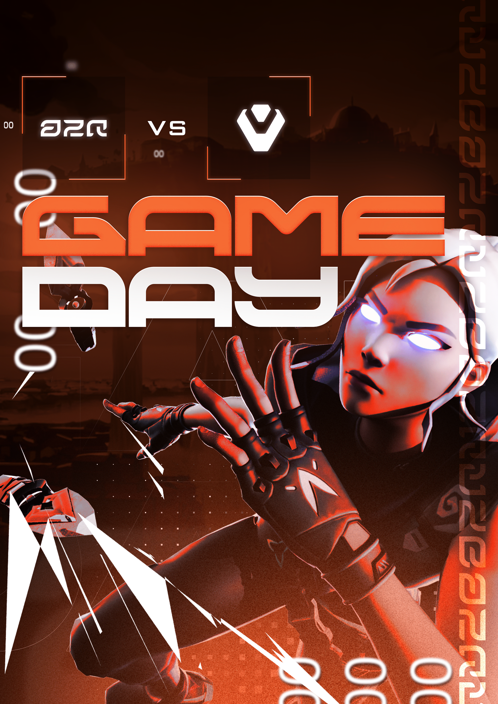
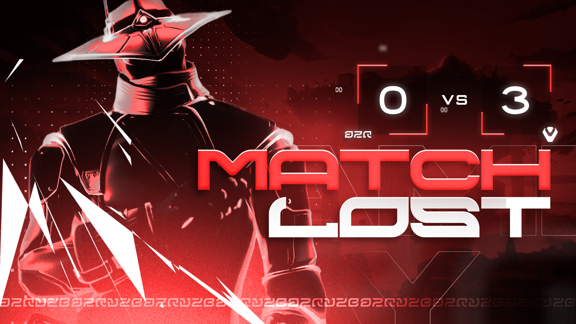
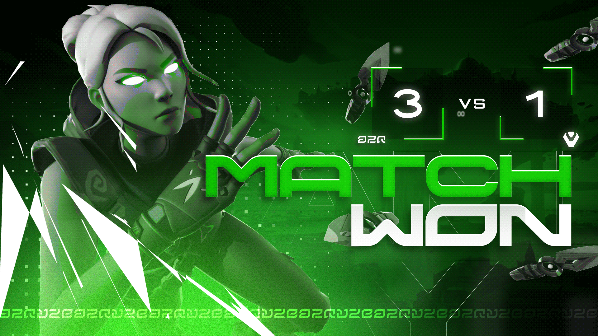
Game Day Visuals
Gameday Visuals are a key part of an esports team’s communication strategy. They build hype, inform the community, and reinforce the team’s identity across platforms. Each post highlights upcoming games, results, or key moments — turning competition into content and strengthening the emotional connection between team and audience.
These visuals serve more than just information; they maintain brand consistency, boost engagement, and create a sense of presence and professionalism. Whether announcing a game, celebrating a win, or teasing a rivalry, matchday posts capture the energy of competition and translate it into visual storytelling.
Thank you for viewing!
Brand Identity — Marvin Kreckwitz
Creative Direction — Marvin Kreckwitz
Logo — Marvin Kreckwitz
Visual Identity — Marvin Kreckwitz
Graphic Design — Marvin Kreckwitz
Year — 2025